
Building the best member engagement solution
Overview
CultureGuide, is a culturally intelligent engagement solution, which empowers health plans to better connect members to the services and care they need, no matter who they are. It is the core product for SameSky Health uses to communicate health plan information and collect data to better serve members.
CultureGuide was moved to a Salesforce platform and was built before SameSky Health had hired a Product Design team. After being launched, the clinical operations team requested the design team to review and make recommendations to improve the experience for the Community Health Guides (CHGs) who were using the platform.
Project Goal
Understand the current CHG team experience using CultureGuide and make design recommendations to better optimize the platform.
Role
I was the researcher and designer on the team. I worked closely with the clinical operations team to coordinate interviews with the CHGs and engineering to align on design and build expectations.
Process

“Knowledge” appears twice on the same screen and has the same functionality
Heuristic evaluation
Because CultureGuide had never been reviewed for UX best practices, I conducted a heuristic evaluation. There were a number of issues including:
Sorting and filtering does not work as standard
Lack of consistency around updating information
Duplication of components and information
Naming is inconsistent and doesn’t match real world

Interviewing a Community Health Guide (CHG)
User interviews
In addition to stakeholder discussions with clinical operations and CHG managers, I interviewed 9 CHGs who are CultureGuide’s primary users. I used Dovetail to synthesize and analyze. Some of the findings from the research were:
Many features and content are not used or used minimally
Some features needed to be shortened and improved to maximize workflows
Filtering for member cases is difficult as it is hard to differentiate based on health plan, preferred language, or if it is a new case
There is a reliance on external applications (e.g. Google Docs) to access content for calls and sms content

initial designs
After the interviews, I created rough initial designs so that the clinical operations and product teams could get an idea of the direction based on the user interviews and the heuristic evaluation findings. This helped us align and gave me additional context to business needs that needed to be included in an updated design.
The initial design included:
Distinct filters under My Cases rather than a search
Member information in one place and easily accessible
A script that can be accessed in the application not requiring use of other external applications
Cutting fields and components that were not being used
updated designs
Based on the research and evaluation findings, I refined the designs with a focus on making the most important information more prominent and eliminating or minimizing features that CHGs were not using. I used Sketch rather than Figma to design because Sketch has a Lightening System (Salesforce design system) plugin which sped up the design work.
The updated design eliminated the additional step it took a user to get to the necessary member information.

The current system required 2 steps for users to get the member information

Most important member information on one page
usability testing
“I wish I was working on this right now.”
After collecting feedback from stakeholders, I updated the design, created prototypes using Marvel, and conducted usability testing with the same CHGs I interviewed to get their feedback. They walked through the prototype and were very positive about the updates. Listen to the short video (less than 2m) to hear some of their feedback.
Usability testing feedback
What worked
Having the majority on one screen/one place
Showing information when needed rather than displaying upfront (progressive disclosure)
Having member verification including most needs in an optimal location
Updated SMS Design improves ability to select the right message
Filters overall, especially for health plan client and preferred language, will expedite the workflow
Location for call coding will make it easier to document
What needs work
Having a script was good but not enough — needed ability to access specific parts, customize and have relevant links
Some filters needed more clarity
Case number to identify member needed to be visible
next design iteration & next steps
I presented this feedback to stakeholders in engineering, product, and clinical operations making recommendations on what we should move forward with (what worked), where some updates were needed on my end (what needs work) and items that required clarification. I also made additional updates to reflect the usability testing feedback (see below).
Meeting are ongoing as we are beginning to add the work to our sprints.
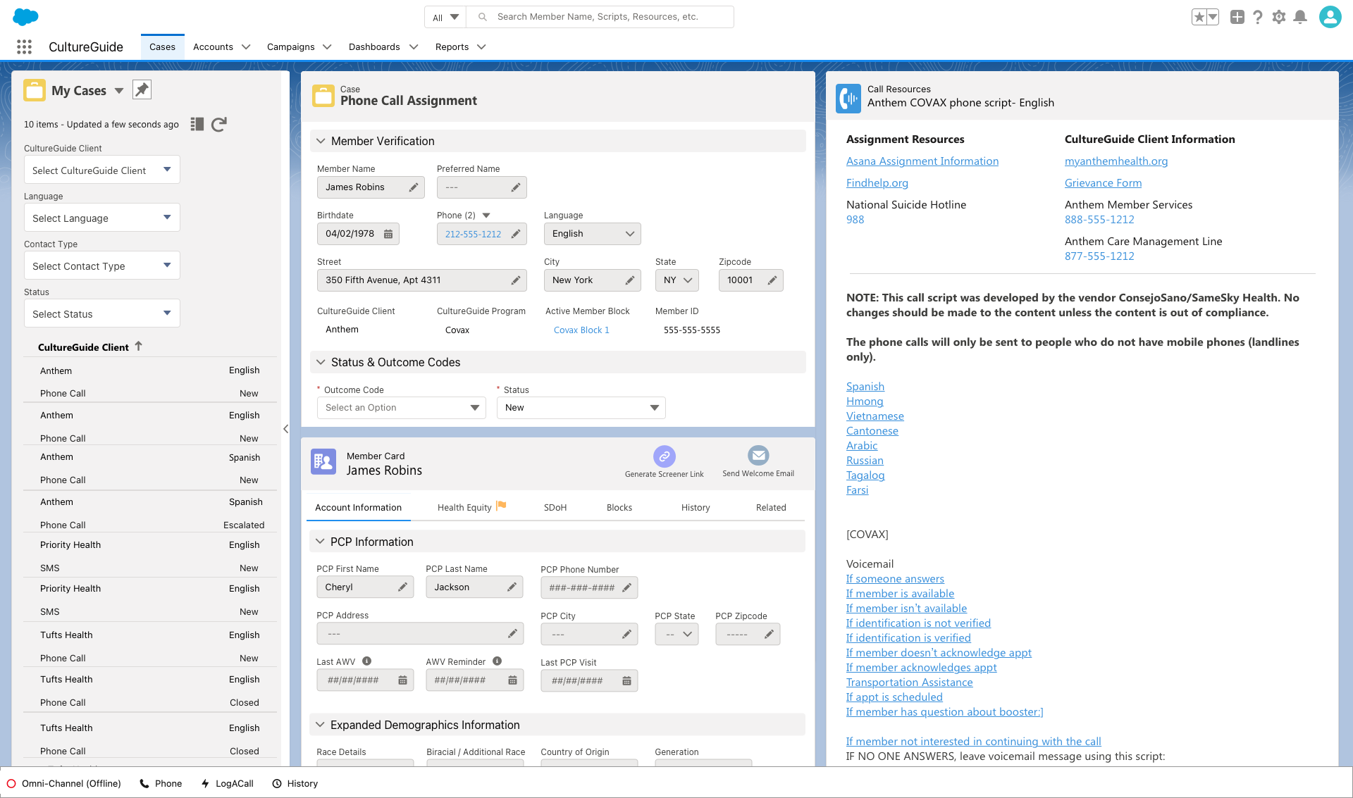
Updated design when a call assignment to a member is selected
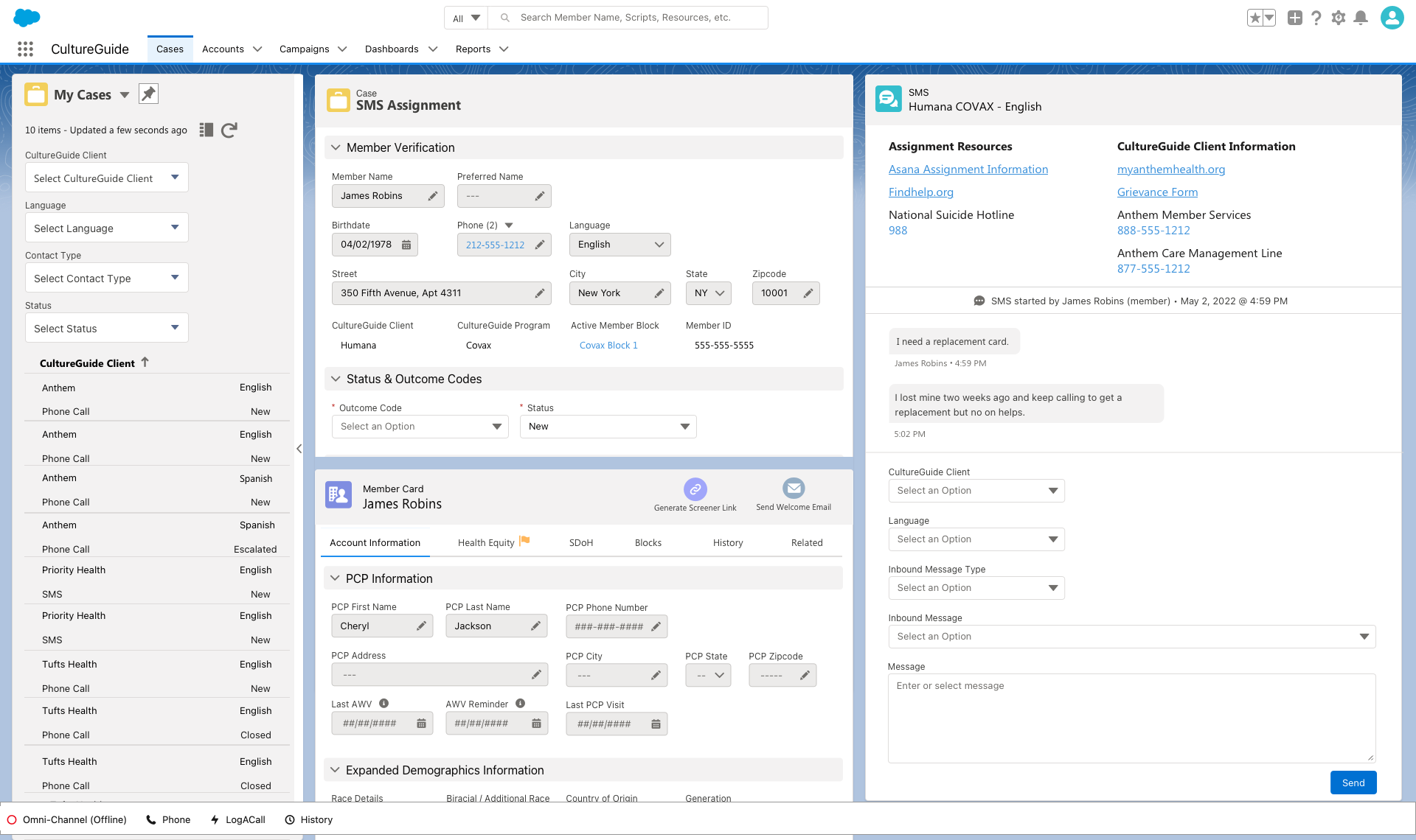
Updated design when an SMS assignment to a member is selected